Thursday, August 11, 2011

Pumpkin Show 2010: Part 6

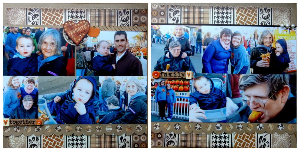
I could have made a few more single-page layouts with the rest of these photos from Day 1 of Pumpkin Show 2010, but since they didn't easily separate into discernible categories or themes, I just threw them all together on a double-page spread summing up the rest of the day.


Photobucket
Apparently, I have no clue how to photograph and crop these layouts, because they're supposed to line up.

Even though I have a stash of bright orange and pumpkin-themed papers for this project, I also kept the Die Cuts with a View Natural Stack handy, since its shades of brown, tan, white, and black went so well with the fall theme. I love how the vertical stripes in this pattern slice through the thick band of photos. I've done stuff like this before by cutting up a bunch of different papers, but I love how DCWV thought to include a paper with stripes of all its patterns so I wouldn't have to go to any work.

Once again, I let a sticker do all the title-work for me. To make it stand out, I elevated it a bit with some foam dots and stuck on a few gems.


Photobucket


I LOVE this giant scallop-edge border punch, and the cover of a recent Scrapbook Trends magazine inspired me to stick different papers behind each hole in the pattern.


Photobucket


Also, I am amazed I finally found a use for these bargain-bin Karen Foster cork word stickers. I've had them for years and almost considered them a lost cause. I guess they just needed the right brown-colored layout and some stickers and buttons to jazz them up. Using old, cheap products and not hating them is such a rush.


Supplies Used:
Patterned Paper: DCWV
Border Punch: EK Success
Stickers: Karen Foster, Heidi Grace, Reminisce, Flair Designs
Ribbon: American Crafts


Wednesday, August 10, 2011

Pumpkin Show 2010: Part 5

Katie was BORN to photograph those deep-fried buckeyes, no?

This "four photos at the bottom and title at the top" layout is another one of my favorite go-to scrapbook page formats for 4x6 prints. It's so easy when the photos do most of the work.


Rather than use another big title on this one, I tried making one of those fun "clustery" page toppers I've been seeing lately:


I envy scrapbookers who make a lot of their own original embellishments, because I really love the end result, but I'm usually way too impatient for this sort of thing and would rather just slap on a pre-made sticker. I had fun with this one, though. layering punched shapes, ribbon, and stickers over and inked-up tag and a chunk of an adhesive border. I might just try this again sometime.

Another "Get Out of Journaling Free" trick I use on my pages is to grab a Dymo embossing label maker to add simple captions to my photos. The fact that they're dimensional and shiny means that they can pull double-duty as both journaling and embellishments. I usually use my classic, all-caps labeler, but instead, for the first time EVER, I got into Katie's scrapbook stash (which collects dust in my closet until she comes to visit me), and I pulled out her nifty Dymo caption maker so I could use these cute lowercase letters, instead. Thanks, Katie!


Supplies Used:
Patterned Paper: American Crafts
Punches: EK Success & Fiskars
Embossing Folder: Provocraft
Stickers: Heidi Grace, Reminisce, Target
Ribbon: American Crafts
Decorative Tape: K&Co.
Label Maker: Dymo

Tuesday, August 9, 2011

Pumpkin Show 2010: Part 4


These photos make me so happy, because it's usually such a struggle to get my adorable mom to smile for the camera, and apparently all it took here was some deliciously greasy food. And doesn't that bloomin' onion look amazing? I'm so lucky Katie shares her pictures with me from our times together so I can scrap 'em. Nobody can capture the deliciousness of food from behind a lens like she can.

This is another super easy layout to make with 4x6 photos. Just lay out two landscape prints and one portrait print, and then cut some patterned paper to 2x4 (a perfect spot for a title) to complete an 8x10-ish block to stick right on your page.


I added some Glossy Accents to the chipboard heart at the center of the page to give it some sheen. I totally love that stuff. I also love it when a page can look complete to me with hardly any embellishment. The stripes on the heart seemed to go really well with the patterned paper under the title, even though they're from different companies, and I liked how the black and white label sticker at the top (from a package found in the stationery section at Target) ties in with the black and white chevron at the bottom of the page.


Supplies Used:
Patterned Paper: My Mind's Eye, fancy pants, GCD Studios
Letter Stickers: American Crafts
Chipboard Heart: Crate Paper
Label Sticker: Target
Dimensional Adhesive: Glossy Accents

Monday, August 8, 2011

Pumpkin Show 2010: Part 3

The beauty of 4x6 photos is how easily they just tile onto a 12x12 layout and make scrapbooking so easy. (Especially when you're like me and can't resist putting all of the pictures from an event onto a page.) If I have 5-6 pictures that go together, I am all about just sticking them end-to-end and calling it done.

(Please excuse the glare on this one. I am so not a pro at photographing layouts.)

That big pumpkin is actually the cover of a chipboard mini album from Maya Road, which I colored by heat embossing it with orange Zing! embossing powder before backing it with a little patterned paper.


Another unwritten scrapbooking "rule" this page breaks is its complete lack of journaling. There's a big movement in scrapbooking to journal the heck out of your albums so that you are making sure you're actually telling your story and not just putting pretty paper with your photos. And althoguh I totally get that argument, and while it might make sense for someone who is trying to be a family historian and pass on a legacy of memories to their children or something, I have to be honest and say that my scrapbooking is pretty much for and about me and my own memories. So, rather than put pressure on myself to make my pages communicate specifics to someone else,  I just do what makes me happy and include the information I think I'll want and care about when I look back through my albums.

Besides, these photos totally tell a story on their own. One that goes something like this:

"Simon's trying his FIRST PUMPKIN BURGER!"

"Hmm. That looks pretty good."

"I WANT SOME OF THAT PUMPKIN BURGER!"

"Gimme! Gimme! Gimme!"

"Yessssss!"

Supplies Used:
Chipboard Pumpkin: Maya Road
Word Sticker: Me and My Big Ideas:
Letter Stickers: American Crafts
Border Sticker: Reminisce
Embossing Powder: American Crafts
Patterned Paper: BoBunny

Scrappy like a FOX

Even though I'm pretty sure this little blog only has two readers (despite the 20 or so Google Analytics is telling me there are), I should still probably point out the recent blog-name change. Since she totally peaked in 1996, I liked "Feast on Scraps" as a scrapbook-blog title much more than I ever did the Alanis Morissette album, but I still figured it was time to change things up a bit. Once I decided to route traceyfox.com here, it seemed to make sense to incorporate my much-better-for-puns-than-my-maiden-name name into the blog title. So, "Scrappy like a Fox" it is. I cordially invite you to update your bookmarks and feeds.

Friday, August 5, 2011

Pumpkin Show 2010: Part 2


Years ago, when I went to the Andy Warhol Museum in Pittsburgh with my friend Dayna, I picked up these super cool paper ribbons with Warhol quotes on them in the gift shop, knowing that they would be great for scrapbooking. And the quote "Everyone is rich, everyone is interesting," seemed to rather perfectly sum up these photos of Katie, our friend Eric, Circleville's famous "Pumpkin Man", and a complete stranger in an awesome deer-head jacket.


To gather ribbon like I did with the orange one, just stitch a line right down the middle of it (by machine or by hand), and pull the thread to scrunch it up.


And how 'bout that cute felt pumpkin? I'm pretty sure I found those in the Target Dollar Spot last fall. Theme-scrapper that I am, I collect pumpkin-themed stuff whenever I find it and toss it into my Pumpkin Show supply stash. It's always fun to pull out a plastic container full of forgotten orange and green treasures when I sit down each year to scrap the event.

Monday's post gets into the really good part of Pumpkin Show -- the food!

Supplies Used:
Patterned Paper: My Mind's Eye, Basic Grey, DCWV
Letter Stickers, Basic Grey, EK Success
Ribbon: American Crafts, KI Memories
Stickers: Me and My Big Ideas
Punch: Martha Stewart Crafts

Thursday, August 4, 2011

Pumpkin Show 2010: Part 1

I'm not gonna lie. Summer doesn't do much for me. And scrappin' these photos from last year's Circleville Pumpkin Show made me totally yearn for fall to hurry up and get here. There's nothing like crisp-but-not-quite-cold weather, the most delicious fair food ever, and visits from Katie.


It's become a tradition for me to scrapbook a bunch of Pumpkin Show layouts every year and put them in albums devoted entirely to the event. After filling the last book (a bright orange number from Kolo) with pages from 2005-2009, this layout is now the very first page in my new Pumpkin Show book, this pretty binder from Basic Grey. Pumpkin Show 2010 ended up with 11 layouts, and since I finally took the time to photograph them before stuffing them into their plastic inserts, I can actually share them here and use this blog what it was originally meant for!


Patterned Paper: Reminisce, My Mind's Eye, Basic Grey, Pink Paislee, Doodlebug
Pumpkin Die Cut: QuicKutz
Punches: Fiskars
Date Stamp: Becky Higgins (Project Life)
Striped Twine: My Mind's Eye
Photo Corners: Scrapbook Adhesives